Branding and Logo
Given that this industry was already a heavily saturated market, I had to identify a point of entry to make a splash large enough for consumers to notice. In order to achieve this, the product's branding needed to evoke a sense of purpose that also resonated with the brand's services -- something to stoke the interest of the community.
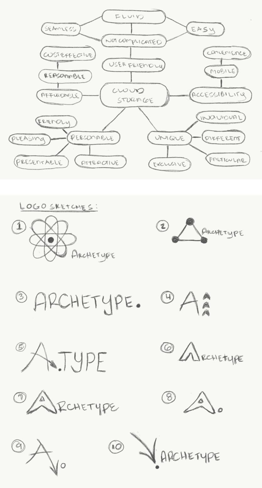
Through the help of some mind-mapping techniques and several sketches of what the product should convey, ARCHETYPE stood out with the most potential of what the brand would stand for.
The meaning behind ARCHETYPE is better expressed as the original pattern or model of which all things of the same kind are a representation of the original source. It will stand for ideas that are attractive yet simple with a creative personality and can be accessible to any content creator.
For the logo portion, I knew I wanted to represent something that was synonymous of what ARCHETYPE stood for.
I set out to work pouring through numerous sketches of what a potential logo could be, but none seemed to have captured my attention. So rather that focusing on a mark, I redirected my focus on the name itself -- a word that is hardly used or heard in everyday conversation and is unique enough to evoke a sense of curiousity of what the product was and what the brand stood for. And after several iterations later, a final concept stood out to be a winning design.


